07.
Web trends and best practices have followed circular patterns since the web’s inception. The first websites focused on content because of technical limitations, but as the options available grew, content took a backseat to creating the coolest and fanciest design with graphics, animation, color, and texture. In the Web 2.0 era, the focus was once again on content, specifically organizational structure of content, and user generated content and interaction. However the rise of social media and mobile devices has led people and companies to see more importance in having a wide online presence, but less focus on what that presence says or does. Similarly, early design was simple (again because there were few options), then complex (skeumorphism), then simple again (flat and authentic design).
So what’s next? The current trajectory of mobile technology suggests we’ll go around the circle again. Users are tired of cluttered, busy sites that are hard to navigate. As mentioned early, the sheer size of the web means that when a user finds a site that’s confusing or hard to use, they know they can search for another site that will get them what they need. As sites lose visitors and companies lose customers, they consider more deeply not only what they have to offer users, but also what the users themselves want. Content will once again be king. But this goes further than just better navigational structure and page design. The rise of mobile devices, wearables, and even augmented reality devices will make us rethink that a “web page” looks like. Already, a single website may look completely different when viewed on a 24” wide screen monitor and a 5” vertical smart phone; columns merge, images get smaller, and clickable areas become larger. Modern websites can detect screen size and render different CSS settings, stylesheets, or even content depending on how small it is. But these size parameters have to be defined and designed for by the web developers and designers, who often struggle to keep up with the wide range of screen sizes and resolutions offered among device makers. And as the screen size gets smaller, users are more likely to be looking for information on the fly and on the go, without time to endlessly scroll or click through half a dozen pages to find what they need. Design can no longer be used to distinguish a site when it has to adapt so drastically to different environments, as each page’s content will take more and more of the screen real estate. This will be even more obvious when browsing comes to wearable devices like smart watches – how do you fit a web page on a 1.5” screen? Designer will have to make hard choices between text and images; there won’t be space for both. Even branding like logos and taglines will have to take a backseat to content. While no current smart watches come with standard browsers, some third-party apps exist that attempt to bring the current web to wearables, with mixed results. But it’s only a matter of time before the major players add Safari or Chrome to their devices, and designers will have to adapt quickly.

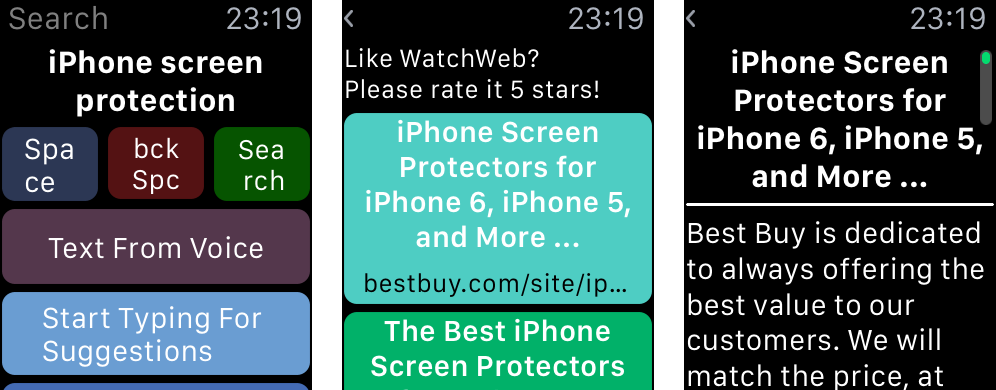
Above, comex (2015) tries to make a Google search on a homemade Apple Watch browser. Below, the WatchWeb app lets you search, but doesn't support links, images, or any web styling (Zibreg, 2015)