04.


Animated images like these (from Cameron's World, n.d.) were commonly used on sites to draw visitor's eye
Even as advertising started spreading across the internet, the web was (and still is) much more than that. As mentioned before, the first website. But as more people got online, websites got bigger and more complicated, and individuals and companies alike looked for ways to stand out and be more memorable for their visitors. Increased internet speeds (the first 56kb/s modem was introduced in 1998, compared to the current U.S. average of 50Mb/s) allowed for more design options, and use the use of images and graphics. The HTML programming language also added several more options for formatting tables, and website owners soon realized they could use tables to design entire pages (like this one) instead of just spreadsheet data. Tables allowed for websites that were not entirely linear, and could have multiple columns and boxes. If creators wanted to make a page out of one large image, they could slice it up and put each piece in a different cell of the table, adding links or animation where needed. Another common design option was frames, which let creators display multiple pages within a single browser window, and navigate between them. Often, the navigation bar would be in one frame, and the main page content in another; clicking on a menu link would change the page displayed in the main frame. But these pages (like this one) could often be confusing for users to follow, as the multiple columns made it hard to know what to read next. This also led to early navigation, with lists of pages along the top or left side of a page. Because links allowed for visitors to get from any page to any other page, navigational hierarchy was often an afterthought, and most pages were “shallow” in their page structure, with every page being a sibling of every other. Sites could have dozens on pages in their navigation with no logical structure, and visitors would get lost or confused easily.
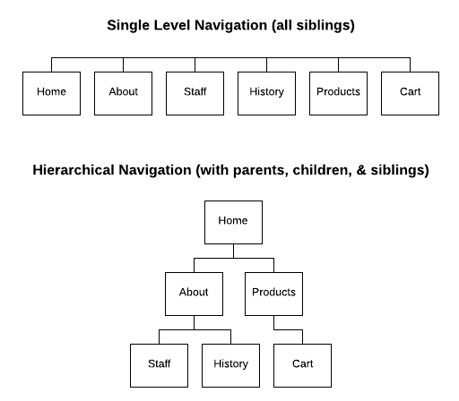
An example of single-layer and hierarchical navigation structure for the sale content.
Over time, people started organizing their websites with second and third level “child” pages that contained information that logically fell under the subject of the “parent” page. Today, content strategy and information architecture are major considerations of website creation, as designers want people to be able to navigate seamlessly through a website. When there were only a few hundred websites, visitors were willing to hunt through a website for the information they needed because it may have been the only place to find it online. But now our attention spans are much smaller, and we know that if one website is difficult to use, there’s one out there that’s easier to use that will still get us what we need.
As the properties and tags available in HTML and CSS grew, website creators pushed their technological boundaries to make more creative designs. Most common were graphics with shadows and highlights to give a 3-dimensional look. This was done to ensure users that these objects were in fact clickable – they would often change color and shape when hovered over, pressed, and released as if they were a physical button. Many corporate sites mimicked real-world settings like offices, airport terminals, or sports stadiums, with clickable areas representing departments. Even simpler websites would use everyday objects relating to a page’s content as buttons or links.
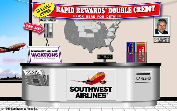
The Southwest Airlines website in 1998, designed to look like a travel agent desk with clickable objects and areas.