05.
Click This
Shiny Button
For a shiny web 2.0 logo generatorThe next design shift can in the mid 2000s, when designers looked for options that were more flexible, compatible, accessible, and better looking than tables. Visitors also grew tired of busy websites filled with textures and objects. Site design shifted to simple shapes and clean lines; so clean, if fact, they were often reflective, using gradients to add a mirrored effect on buttons, navigation, and other elements. They steered clear of animations, columns, textures that early websites thrived on. Buttons were also reserved for important call-to-action functions like “Learn more” “Sign Up” and “Click Here for a Free Demo” and less intrusive links for other functions. These designs did retain some of the more useful innovations from early websites. Navigation menus remained along the side or top of the page, although they were much cleaner and integrated into the page design instead of being a focal point themselves. They also began using drop-down menus to more easily facilitate hierarchical menu structures. These trends are often referred to as Web 2.0 design, but Web 2.0 has come to refer to more than just design elements. It was also a move towards content that was generally simpler and easier to navigate. Content was tagged and categorized within a site, making it easier to browse and search. Forums and comment sections also became more common, allowing users to not just view but interact with web content. Web 2.0 also led to a rise in Content Management Systems like WordPress and Drupal, which let users with little technical knowledge not only create a website, but also implement these more advanced interaction features that required a database to power the website. While websites were the realm of scientists, programmers, and tech nerds, now people from every industry, field, and interest were able to make a website about something they loved.
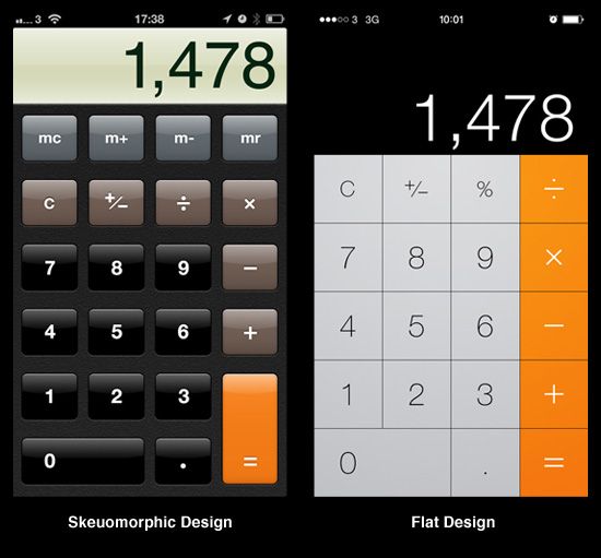
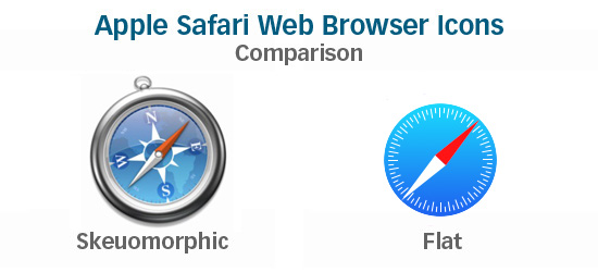
With the rise of mobile devices, tech companies wanted to help shift consumers from their notebooks and planners to using a single device for everything. This led to a rise in both web and app design of skeuomorphism or making a digital object look like a physical object. If this sounds familiar, it is; early websites sometimes used skeuomorphic design when creating an entire website that looked like a desk or a notebook. This form of skeuomorphism combined this use of real-life objects with the 3-d gradients of Web 2.0 to create interfaces that looked as tactile and real as possible. The skeuomorphic charge was led by Apple, when designing default apps and icons for the iPhone and later OS X; calendars with leather stitching, dials and switches for settings control, contact lists with pages and tabbing. It helped ground new technology to the objects it was replacing, much like the floppy disk "Save" button helped early computer users understand what that button did. But this realism resurgence was short lived. Quickly, users understood what their apps and programs were supposed to do, and the realistic touches began to look cluttered or even confuse people who were used to the physical object acting a certain way (you couldn't really turn the pages of your address book in iOS). The result is the current trend often call Authentic Design or Flat Design (used more specifically in a digital context). It uses the clean lines of Web 2.0 design, but does away with attempts to look like something it isn't.
"Authentic design is about using materials without masking them in fake textures, showcasing their strengths instead of trying to hide their weaknesses. Authentic design is about doing away with features that are included only to make a product appear familiar or desirable but that otherwise serve no purpose." (Fadeyev, 2013).
Comparisons of early skeuomorphic Apple apps and icons that look much like the real-world objects they represent, and more recent, flatter, designs. (Debus, 2013)